Principal Component
Analysis
What is it in a nutshell?
Principal component analysis (PCA) uses a vector space to visually highlight and display any variance or relationships that exist between variables and samples. Essentially you are trying to maximise the visualisation of information whilst reducing the impact of noise or unimportant data. You are taking a large amount of data, analysing and reorganising it onto a vector space that is much smaller that the original data and constructed on new variables that are linear combinations of the original variables. PCA therefore reveals what is important and enables you to make decisions.
Common Jargon and Buzzwords
Data reduction, Dimensionality, Structure, Correlation, Inference, Orthogonality, Dependent/Independent variables, Exploratory Data Analysis, Pattern recognition, Classification, Projection.
Where did it come from?

Karl Pearson
Shim Harno / Alamy Stock Photo
PCA was invented in 1901 by Karl Pearson and further developed into what we know today by Harold Hotelling in 1933. Widespread use of the method on sizeable data was not possible until the advent of computers some decades later.
It still remains to be one of the foundational techniques of Multivariate data analysis (MVDA) and it is becoming more and more relevant in the data driven modern world.
How does it work?
A general understanding of statistical methods, linear algebra and regression will make this section easier to follow. Recall that PCA is a manipulation of a data matrix where the aim is to display the variance and relationships (correlation) within the data onto a new set (project) of compressed variables known as eigenvectors (principal components, (PC)). The multivariate data is displayed and viewed in a way that a small number of variables (PC’s) can explain the variance that is “hidden” in the original variables (columns) in your data matrix.
A way to easily grasp the concepts of PCA is to consider an example with a manageable number of objects. For example a factory line is considering implementing a new process analytical technology (PAT ) instrument that can measure the concentration of a raw material quicker that the existing instrument. A series of 15 batches of raw material are measured with the two instruments.
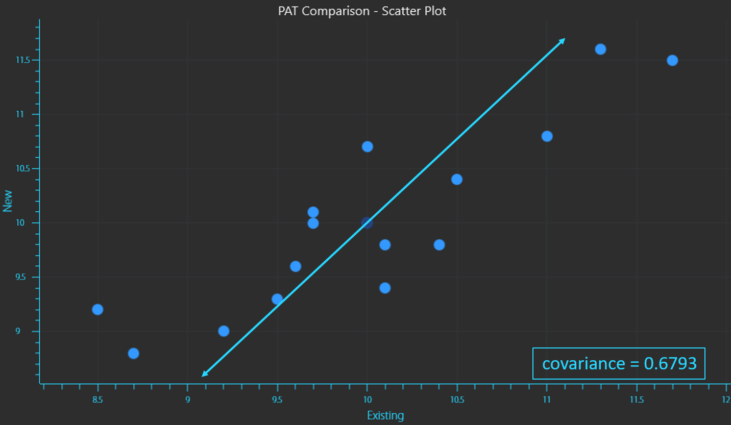
A (n x p) data matrix has “n” objects, samples or rows and “p” variables or columns, hence the factory has a 15 x 2 data matrix. If each pair of concentration readings (rows) were considered to be co-ordinates (x,y) on a cartesian plane (with the X-axis representing the existing instrument and the Y-axis representing the new instrument), a scatter plot can be generated displaying the spread of the measured values.
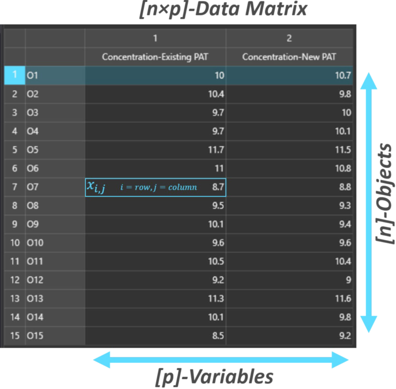
Data matrix for comparing existing vs new PAT instrument readings.
KaxGroup, VEKTOR DIREKTOR
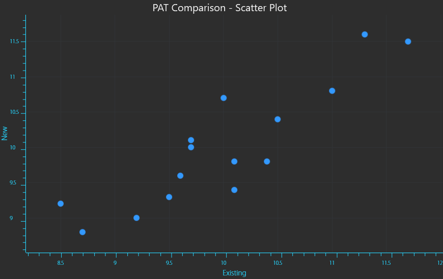
X,Y Scatter plot of readings from existing (X) vs new (Y) PAT instrument readings.
The data will have a Mean value or an average point that is the “centre of mass” for all of the data points (equation 1). This would simply be the “X,Y” coordinates given by the average measurement of each instrument. The mean is calculated by taking the sum of all measurements and dividing by the number of measurements.
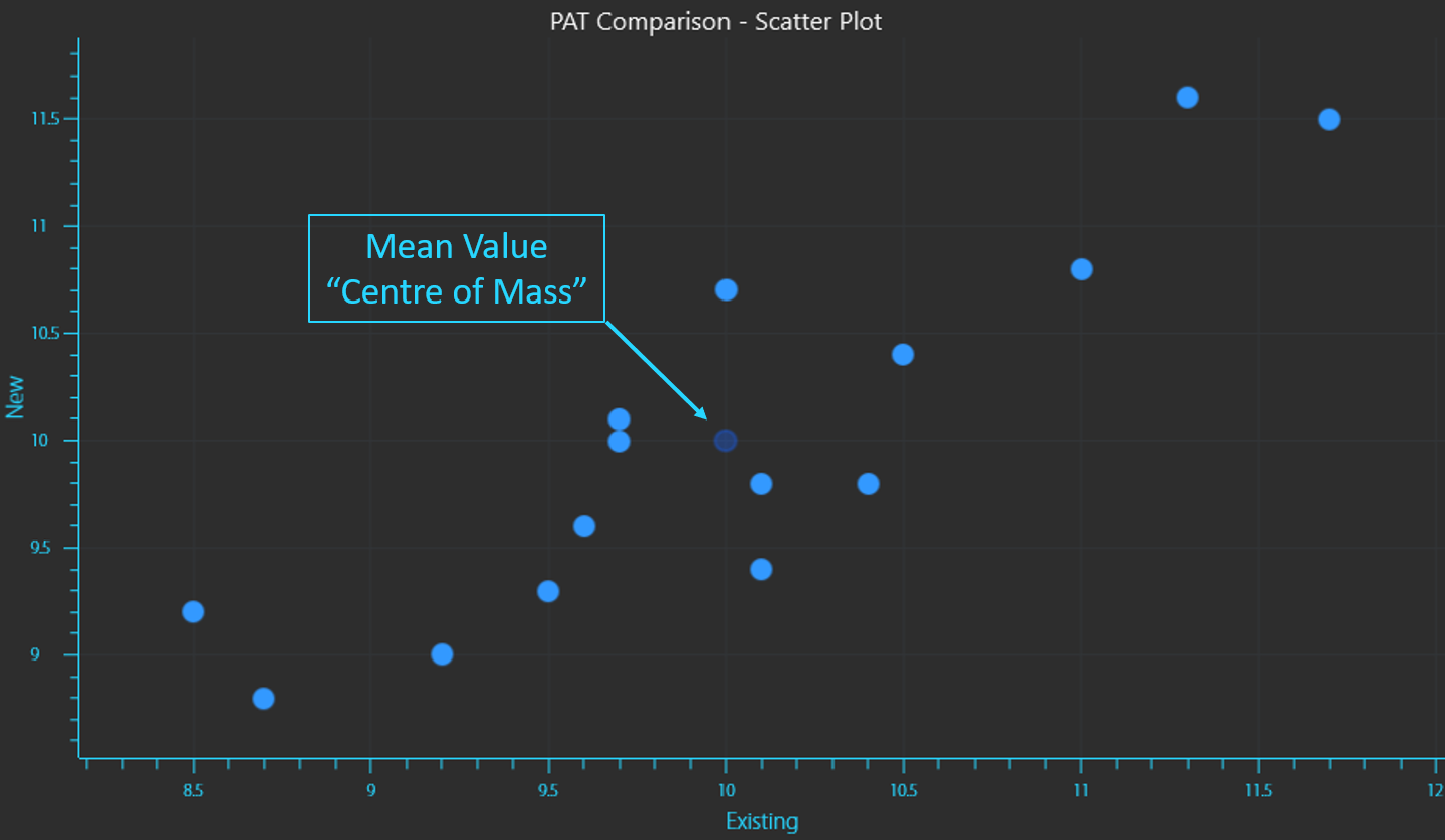
Mean value of PAT instrument readings.

The concentration readings from the existing instrument will have a Variance which is a measure of the dispersion or spread of the data (equation 2). The same variance can be calculated for the concentration readings from the new instrument.
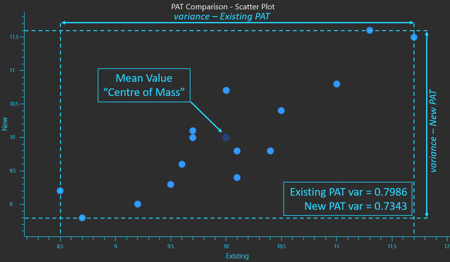
Variance of existing PAT measurements (X) vs new (Y).

Variance is calculated by taking the sum of the squares of each reading minus the mean value (distance from the mean) and dividing it by the number of samples minus 1 (if the entire sample population has not been collected which is usually the case). Since each value is squared, variance is always a positive value.
Covariance is a measure of the combined variance of the variables. As the description suggests it is calculated by taking the sum of each reading of the existing instrument “X” minus the mean value for X, multiplied by the same calculation for the new instrument “Y” minus the mean value for Y. This sum is divided by the number of samples minus 1 (equation 3). Note that this calculation is not a sum of squares and the results can be positive or negative.
If the 2 variables are correlated (increase or decrease together in a similar way), the covariance will be positive. If the 2 variables are inversely correlated (one increases as the other decreases), the covariance will be negative.
Variance of existing PAT measurements (X) vs new (Y).

Variance is calculated by taking the sum of the squares of each reading minus the mean value (distance from the mean) and dividing it by the number of samples minus 1 (if the entire sample population has not been collected which is usually the case). Since each value is squared, variance is always a positive value.
Covariance is a measure of the combined variance of the variables. As the description suggests it is calculated by taking the sum of each reading of the existing instrument “X” minus the mean value for X, multiplied by the same calculation for the new instrument “Y” minus the mean value for Y. This sum is divided by the number of samples minus 1 (equation 3). Note that this calculation is not a sum of squares and the results can be positive or negative.
If the 2 variables are correlated (increase or decrease together in a similar way), the covariance will be positive. If the 2 variables are inversely correlated (one increases as the other decreases), the covariance will be negative.

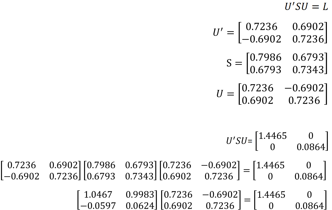
A p x p symmetric, nonsingular matrix like the covariance matrix (S) can be reduced to a diagonal matrix (L) by pre and post multiplying it by a unique orthonormal matrix (U) (equation 5).

Now that the variance and covariance for the data can be calculated, what is known as the covariance matrix (or correlation matrix) can be generated (equation 4). A covariance matrix is always a square matrix (p x p) with p being the number of dimensions in the data. Since this data has 2 column variables the covariance matrix is a 2 × 2 matrix and it describes how each variable of the input data set varies from the mean. The covariance matrix is constructed by compiling the covariance for each possible combination of the initial variables.

Eigenvectors can then be computed by solving equations 7 and 8. First use the value for 𝑙1.


Then using the value for 𝑙2 we get the characteristic eigenvectors for U.


Plugging these values for U and S back into equation 5 proves that the equation is correct.
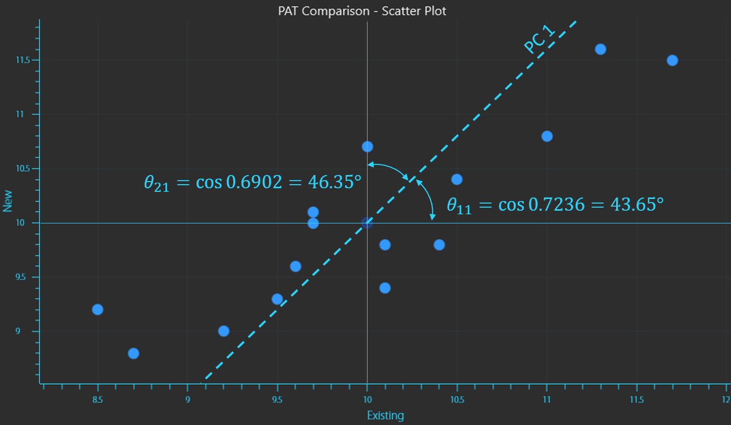
The eigenvectors that we calculated are the direction cosines of the new variables (PCs) rotated from the original coordinate axes.
Calculating the inverse cosine of the vectors provides the angles that position the new vector.
The calculation of the second vector displays the orthogonal relationship between vectors as it is at 90° to the first vector.
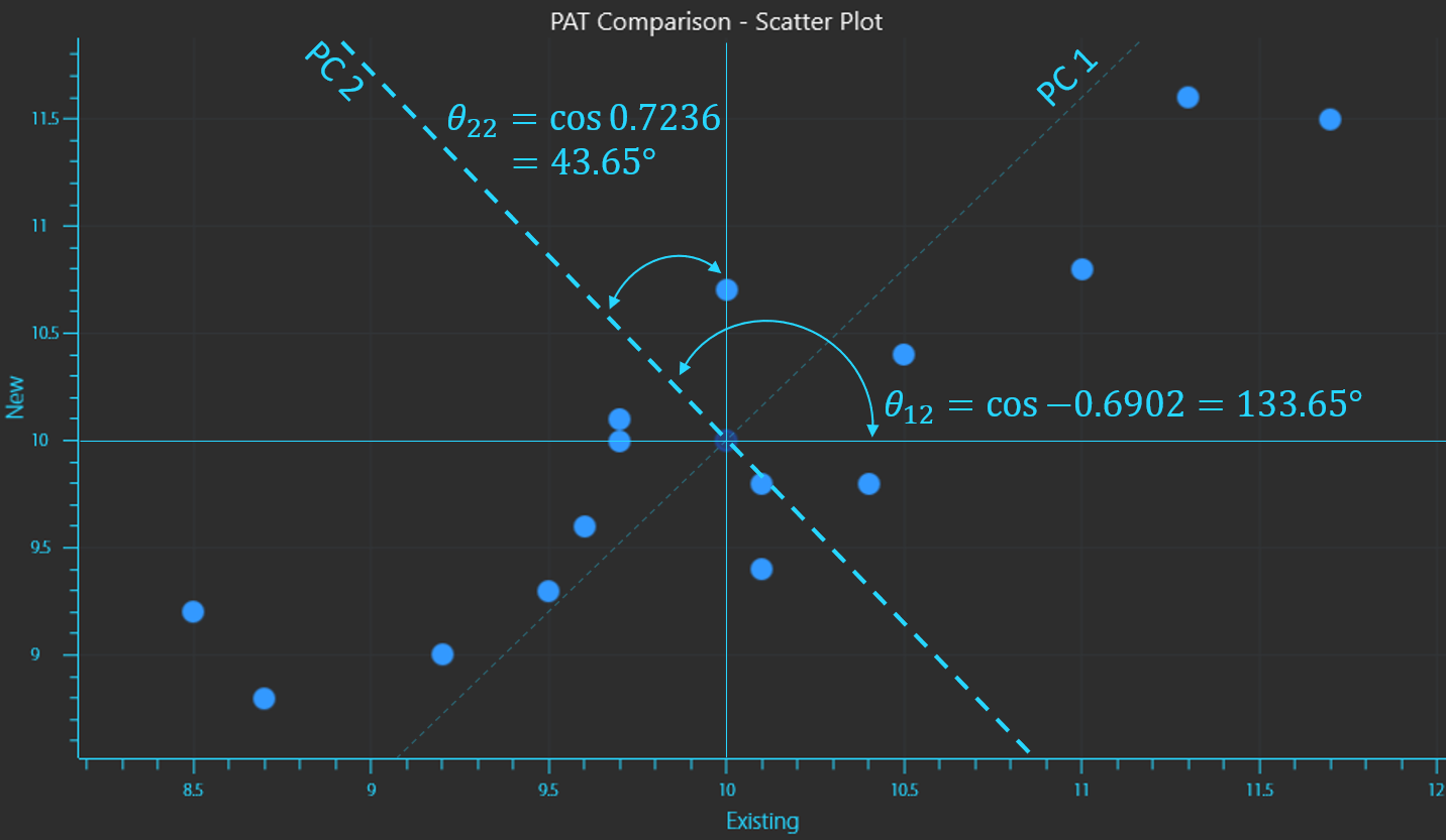
Calculation of the inverse cosines to determine the vector placement of principal components 1 and 2
In this way a principal component (PC) is a new vector onto which the variance of a data set is projected, thereby maintaining most of the original variance, but by using fewer PCs the dimensionality of the dataset is reduced considerably and the information is compressed and described in a better way. The distance from a data point to the PC is called a residual. PCA will compute PCs in which the residual is the least for all data points.
A more simplistic approach to how it works
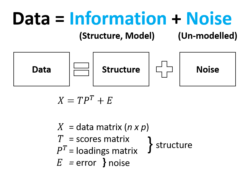
Multivariate data can be considered to be made up of Information and Noise. Information (or structure) can be further described as components of the data that are important to you and Noise can be described as everything else that hinders you from seeing what is important to you. In this way PCA can deconstruct your data (X) into separate components including a scores matrix (T), a loadings matrix (P) and an error matrix (E). The structure that is within the scores and loadings can be separated and interpreted away from the noise in the data.
Mean value of PAT instrument readings.
The scores can be considered to be a new map or new vector space which is used to describe the variance in the original data but with fewer components. Remember that the original data is projected onto this new space and preserves most of the original information but not all. This is the cost that we are OK to pay given we receive dimension reduction and a concentration of information. The loadings can be considered to be a map of the variables that brings meaning to what we observe in the scores. It is a regression of X on T. The residuals or error are components of the data that do not add to the information and are not modelled or explained well by PCA and best left out.
Example_Comparison of nutritional content of food
Consider two of the world’s most popular hamburger restaurants; McDonalds and Hungry Jack’s (also known as Burger King). Nutritional information for each menu item is readily available on their respective websites, however, comparing nutritional content across multiple menu items quickly demonstrates the difficulty humans have analysing multivariate data. Similar menu items and their nutritional content is displayed on the following page.
| McDonald’s | |||||||
| Per 100g | Energy (KJ) | Protein (g) | Fat (total) (g) | Saturated Fat (g) | Carbohydrate (g) | Sugars (g) | Sodium (mg) |
| Big Mac | 1010 | 11.6 | 13.4 | 5 | 18 | 3 | 438 |
| Cheeseburger | 1050 | 13.5 | 11 | 5.5 | 23.9 | 4.7 | 588 |
| Double Cheeseburger | 1070 | 15.2 | 13.5 | 7.2 | 17.4 | 3.7 | 610 |
| Triple Cheeseburger | 1070 | 16.1 | 14.9 | 8.1 | 14 | 3.1 | 621 |
| BBQ Bacon Angus | 1140 | 17.2 | 15 | 7.2 | 16.7 | 4.3 | 559 |
| Classic Angus | 957 | 13.4 | 12.7 | 6 | 14.5 | 2.9 | 363 |
| Chicken Nuggets (10 Pack) | 1120 | 15.9 | 15.9 | 2.4 | 15 | 0.3 | 489 |
| Grilled Chicken Deluxe Burger | 925 | 13.6 | 12 | 2.6 | 14.3 | 2.1 | 387 |
| Chicken McBites | 1150 | 16.8 | 17.8 | 1.7 | 11.7 | 0.5 | 647 |
| McChicken | 977 | 10.2 | 11.7 | 1.9 | 21.3 | 2.2 | 329 |
| McSpicy Burger | 1080 | 13.2 | 13.3 | 2 | 20.9 | 2.1 | 528 |
| Fries | 1190 | 4.6 | 14.4 | 1.2 | 32.6 | 0.2 | 269 |
| BBQ Sauce | 697 | 1.1 | 0.2 | 0 | 39.2 | 35 | 622 |
| Sweet and Sour Sauce | 727 | 0.5 | 0.2 | 0 | 41.6 | 37.3 | 451 |
| Sweet Mustard Sauce | 1170 | 1 | 10.3 | 0.7 | 45.2 | 20 | 390 |
| Ketchup | 478 | 1.5 | 0 | 0 | 26.1 | 20 | 983 |
| Hash Brown | 1060 | 2.3 | 14.7 | 1.2 | 26.7 | 0.3 | 613 |
| Hotcakes with Syrup and Butter | 1120 | 4.2 | 8.3 | 3.8 | 42.9 | 19.8 | 258 |
| Bacon and Egg McMuffin | 918 | 14.1 | 9.6 | 3.9 | 18.4 | 1.9 | 496 |
| Mighty McMuffin | 955 | 15.4 | 11.8 | 5.2 | 14.5 | 3.2 | 583 |
| Sausage and Egg McMuffin | 1010 | 14.8 | 13.3 | 6.1 | 15.3 | 1.5 | 381 |
| M&M Minis McFlurry | 911 | 4.2 | 8.1 | 5.3 | 31.4 | 29.5 | 46 |
| Oreo McFlurry | 803 | 4 | 6.9 | 4.4 | 28.1 | 23.3 | 84 |
| Soft Serve Cone | 695 | 4.1 | 5.1 | 3.5 | 25.4 | 20.8 | 53 |
| Caramel Sundae | 842 | 3.3 | 5 | 3.5 | 34.9 | 25.7 | 69 |
| Plain Sundae | 651 | 3.9 | 5.1 | 3.5 | 23.1 | 21.6 | 42 |
| Strawberry Sundae | 727 | 3.3 | 4 | 2.8 | 30.5 | 27.4 | 34 |
| Hungry Jack’s | |||||||
| Per 100g | Energy (KJ) | Protein (g) | Fat (total) (g) | Saturated Fat (g) | Carbohydrate (g) | Sugars (g) | Sodium (mg) |
| Double Whopper® Cheese | 1080 | 14.0 | 17.0 | 7.0 | 12.5 | 2.6 | 392 |
| Cheeseburger | 1090 | 13.6 | 11.6 | 5.1 | 25.4 | 3.9 | 501 |
| Double Cheeseburger | 1140 | 16.3 | 14.9 | 7.2 | 18.7 | 3.1 | 475 |
| Triple Cheeseburger | 1170 | 17.8 | 16.7 | 8.4 | 14.9 | 2.6 | 459 |
| Grill Masters Angus Bacon & Cheese | 1260 | 17.7 | 20.9 | 11.7 | 10.4 | 2.5 | 515 |
| Whopper® | 978 | 9.4 | 14.1 | 4.2 | 17.4 | 2.9 | 306 |
| Chicken Nuggets (12 Pack) | 1050 | 13.7 | 12.9 | 1.8 | 20.0 | 0.9 | 402 |
| Grilled Chicken Classic | 878 | 13.7 | 9.4 | 1.5 | 17.4 | 1.8 | 404 |
| Pop’n Chick’n | 1040 | 13.7 | 13.2 | 2.2 | 18.7 | 1.9 | 570 |
| Chicken Royale | 1450 | 9.8 | 21.1 | 2.7 | 29.6 | 2.3 | 487 |
| Jack’s Fried Chicken Spicy | 1130 | 10.0 | 16.7 | 4.6 | 19.9 | 3.8 | 380 |
| Chips | 1114 | 3.2 | 12.3 | 1.7 | 35.5 | 0.2 | 512 |
| BBQ Plum Dipping Tub | 832 | 0.6 | 1.0 | 0.3 | 45.5 | 41.0 | 887 |
| Sweet ‘N’ Sour Dipping Tub | 623 | 0.3 | 0.3 | 0.3 | 36.1 | 31.6 | 639 |
| Honey Mustard Dipping Tub | 1440 | 0.8 | 18.0 | 1.6 | 44.8 | 40.4 | 508 |
| Ketchup | 508 | 0.8 | 0.0 | 0.0 | 27.5 | 25.0 | 817 |
| Hash Brown | 1172 | 2.4 | 19.0 | 2.1 | 26.0 | 0.5 | 419 |
| Pancakes syrup & Butter | 1069 | 4.0 | 8.9 | 2.9 | 38.7 | 14.2 | 253 |
| Bacon & Egg Muffin | 839 | 11.8 | 8.7 | 3.3 | 17.7 | 1.8 | 485 |
| Jack’s Brekky Roll | 1080 | 14.2 | 16.5 | 9.0 | 12.6 | 3.1 | 540 |
| Sausage & Egg Muffin | 932 | 13.4 | 11.6 | 4.4 | 15.5 | 1.6 | 404 |
| Storm M&M’S® Minis | 874 | 5.0 | 8.5 | 5.5 | 27.6 | 27.2 | 105 |
| Storm Oreo ® | 807 | 5.1 | 7.4 | 4.6 | 26.2 | 22.3 | 155 |
| Soft Serve Cone | 735 | 5.0 | 6.6 | 4.4 | 23.8 | 21.1 | 114 |
| Caramel Sundae | 801 | 4.7 | 6.8 | 4.9 | 27.4 | 26.3 | 119 |
| Vanilla Sundae | 879 | 6.1 | 8.4 | 5.6 | 27.2 | 27.2 | 138 |
| Strawberry Sundae | 709 | 4.4 | 5.9 | 3.9 | 24.9 | 24.5 | 96 |
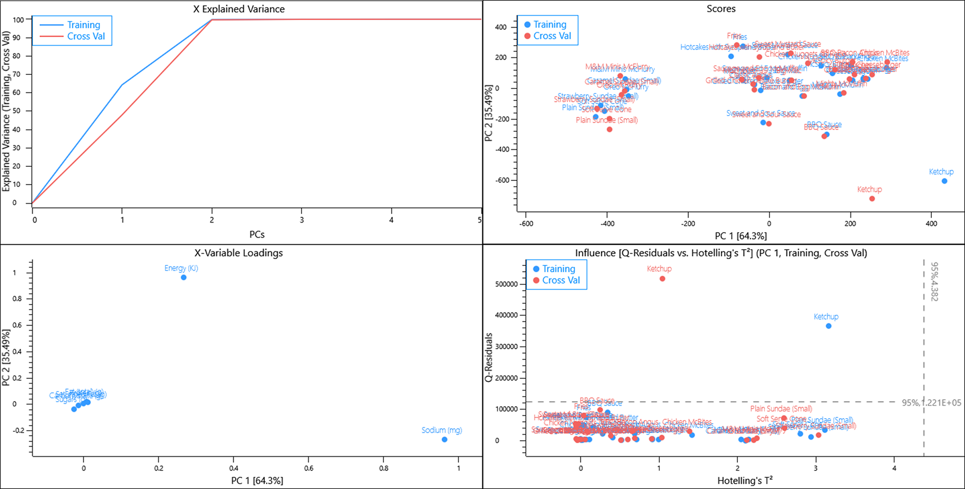
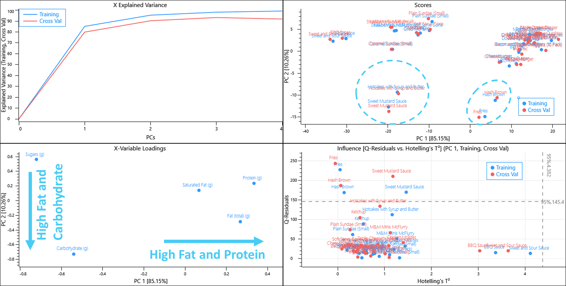
Using a random cross validation of the data almost all of the variance is captured in 2 PCs. The scores plot shows some grouping of similar items whilst ketchup lies far from the other items. The loadings plot informs us that Energy and Sodium are causing a lot of the variance that we see in the scores plot and since Data equals Scores multiplied by Loadings, and Ketchup has a positive score and loading along PC1, we can interpret that Ketchup has a lot more salt per 100 g when compared to the other menu items.
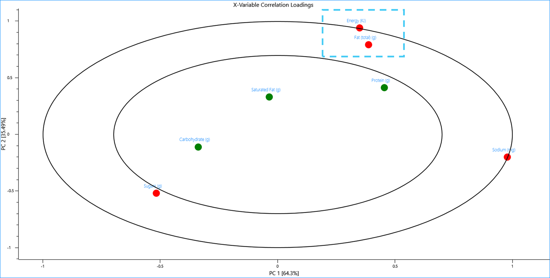
Energy has a unit of Kilojoules and sodium has a unit of milligrams whilst every other nutritional value is measured in grams, hence, these variables “look” different to PCA and this is displayed in the plots. Looking at the 2D-Correlation loadings however reveals PCA still recognises that energy and fat are correlated and items with high energy content tend to also have high fat content.
All of the variables can be considered to be unique values of each menu item but Energy is a calculation that is dependent on several of these variables. Removing this variable from the model directly impacts the X-explained variance plot and almost all of the variance is captured in the first PC due to the units being in milligrams.
Again the Scores and Loadings plots inform us that the high salt content of ketchup really distinguishes this single object from the rest of the menu items and it is having a large influence on the model.
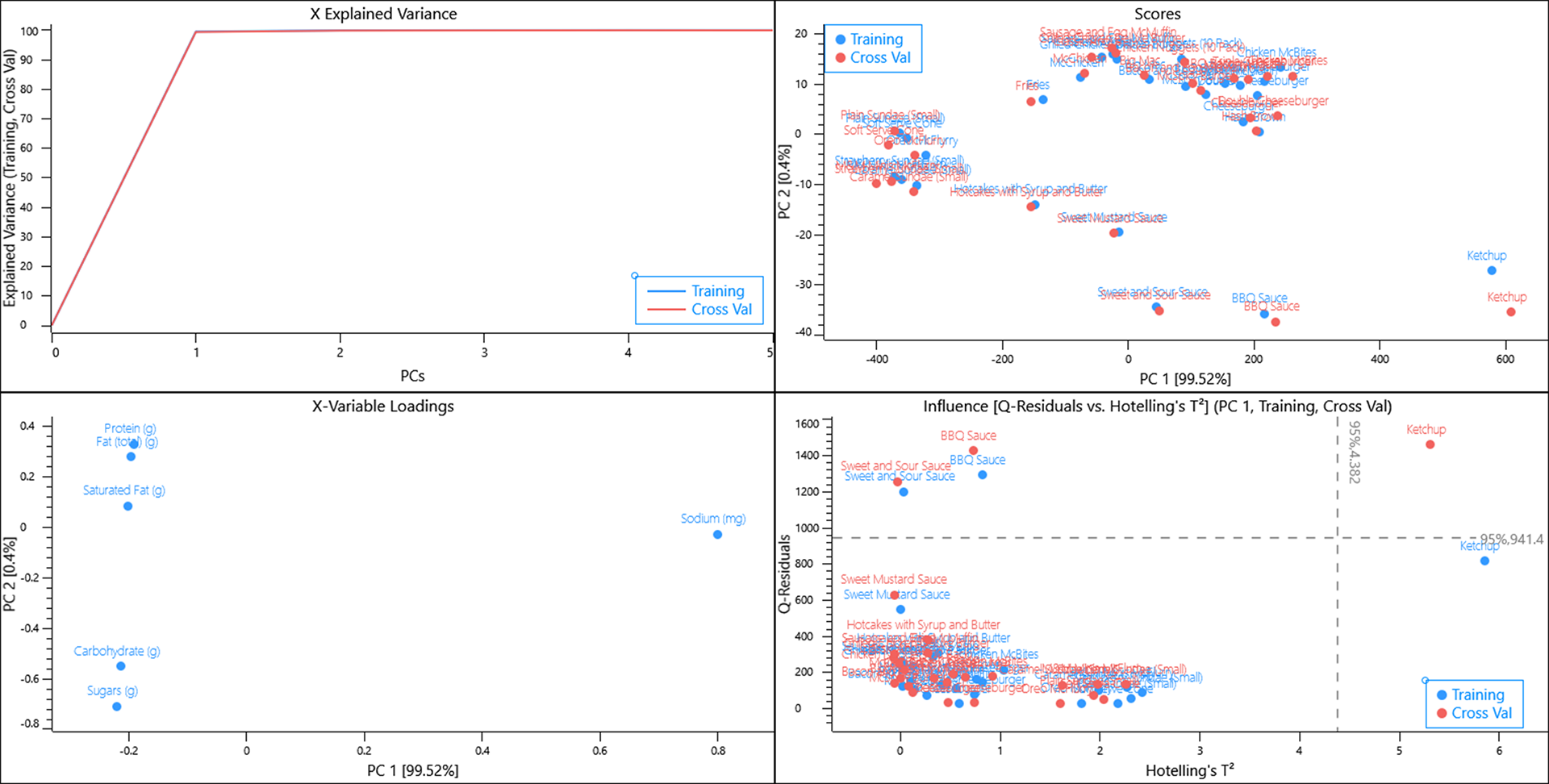
Removing the sodium variable from the dataset essentially splits the menu items to those that are high in protein, fat and saturated fat whilst being low in sugar and carbohydrates and vice versa.
Hash browns and Fries are a unique group of items that are high in fat and carbohydrates but low in protein whilst Sweet mustard sauce is unique amongst sauces having a high fat content.
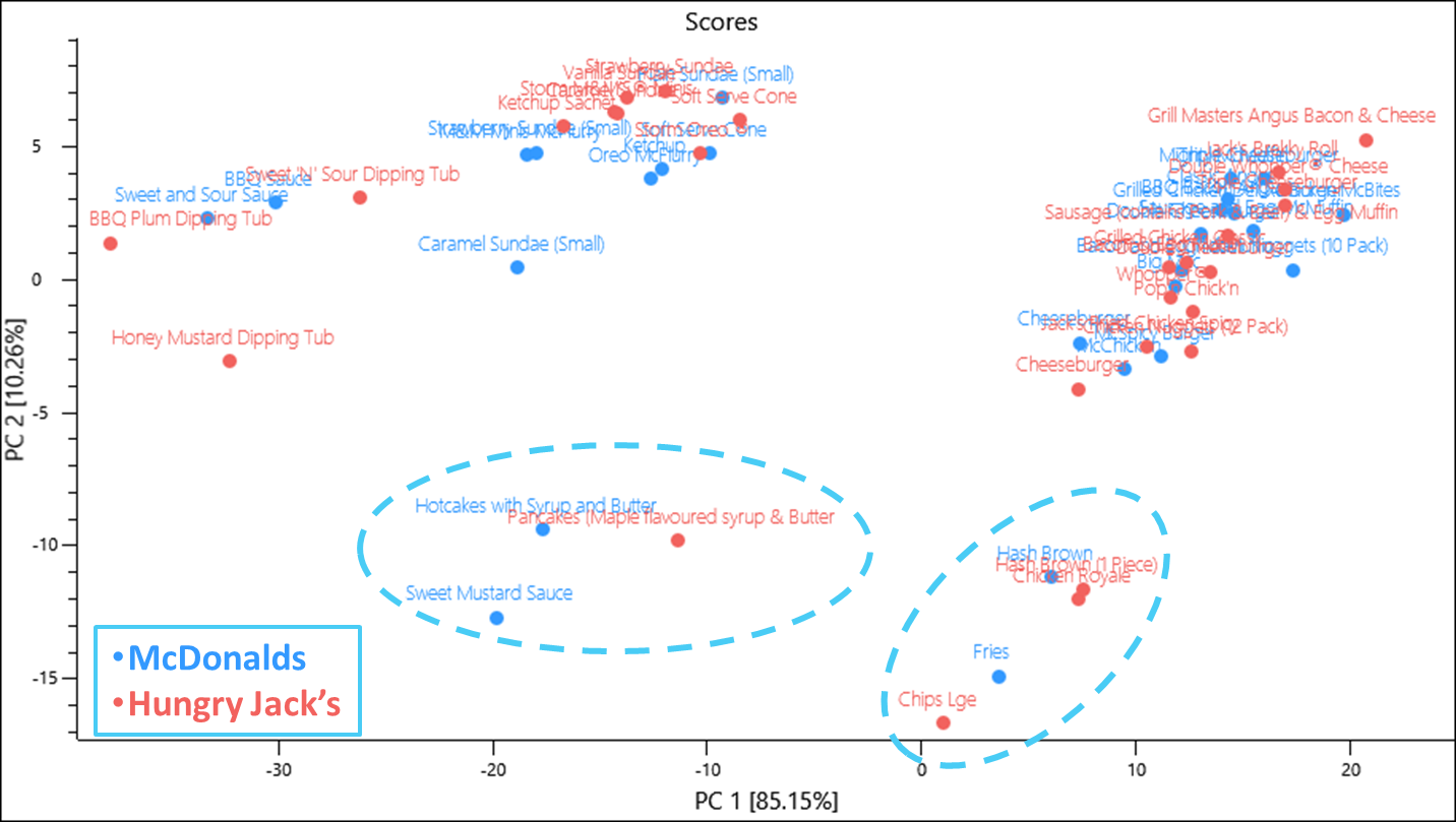
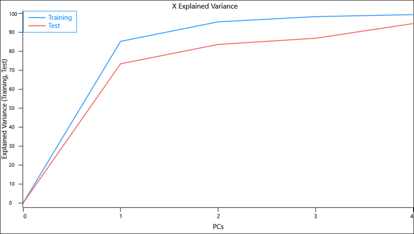
By using the nutritional information for Hungry Jack’s products as a validation test set we can assess if the nutritional content of the food provided by both restaurants are similar or significantly different.
The test set X-explained variance values suggest that the model is not capturing as much of the variance in the same number of components
Overall however, similar products lie within the same area of scores space with items containing meat occupying the space correlated to high protein and saturated fat, fried items occupying the space correlated to fat, dessert items occupying a space high in carbohydrates and sugar. Interestingly a Chicken Royale falls into the space that describes deep fried potato products and whilst it does contain what looks like a deep fried chicken fillet, its comparative McDonald’s product the McChicken also has what looks like a deep fried chicken fillet. Whilst we don’t know how either product is made, based on their website images the Chicken Royale has mayonnaise on both buns whilst the McChicken only has mayonnaise on the top bun and this may be a contributing factor. In any case the Chicken Royale had the highest fat content per 100 g of any menu item from both data sets and also a high carbohydrate level.
As it can be difficult to interpret all of these objects, a separate analysis of like objects can be performed. By creating a separate model on only protein containing and dessert items a comparison can be made more easily between comparable menu items.

Some interesting patterns emerge when analysing the scores and loadings plots.
- Saturated fat and protein increases as you add more cheese and beef patties to your
cheeseburger. - A Cheeseburger from McDonald’s contains more protein per 100 g, however, a Triple
Cheeseburger from Hungry Jack’s contains more protein whilst the Double
Cheeseburger from both restaurants are almost identical. - Chicken containing items from McDonald’s contains more protein than their Hungry
Jack’s counterpart item. Interestingly 10 Chicken Nuggets from McDonald’s contains more protein than 12 Chicken Nuggets from Hungry Jack’s.

When viewing the data from the dessert menu, items from Hungry Jack’s contains more fat and saturated almost across the board for the items included in this data set.
Example_Detection of sampling artefacts in spectra
A common annoyance when using mid-infrared spectrometers is the sensitivity of the technique to water vapour along the beam path. To combat this, manufacturers will use desiccants or design purge systems with inert gases (such as nitrogen or dry air) however, all too often these systems will fail and water vapour from the atmosphere or other sources will find its way into the system.
Consider a spectrometer that has a multi-position setup to automatically measure 96-well silicon plates. This kind of instrument can be used to sample and measure microlitre volumes of biological fluids with an aim to create a simple, cheap and effective way to detect diseases by means of a multivariate data model. A caveat to the setup is that the user must specify if they want to collect a background spectrum before measuring every position (essentially a doubling of measurement time) or if they would like to use a single background spectrum, collected prior to measuring samples, and use it for every sample measured on the plate. Another caveat to the instrument is that the manufacturer of the silicon plates used decided to change the etching protocol resulting in two distinct designs of surface microstructure. According to the instrument manufacturer, these new plates pass design specifications and shouldn’t cause any problems.
Faced with these decisions, a spectroscopist designs a series of test, methodology experiments to study the effects of choosing one over the other in conjunction with other variables such as the number of scans used and differing humidity levels. For the purposes of this example, a 1 microlitre aliquot of the same stock blood plasma solution has been loaded on every position of a plate (except one for the background), for each etch design, and allowed to dry at room temperature. The humidity within the instrument has been controlled to measure the same samples at an instrument hygrometer reading of 0%, 10% and 20% relative humidity (RH). A further caveat to this value is that the instrument hygrometer records at intervals of 10% only hence a reading of 0% could be 0-9% whilst a reading of 10% could be a 10-19% RH.
When a background is selected prior to each measurement the change in humidity is still a major source of variation in the data which would be problematic when constructing a predictive model.

The scores and loadings plots show a linear effect along PC 1 caused by distinct water vapour loadings. The distance of objects describing a RH of 10 and 20% from 0% suggest that the RH for the objects in the 10% class may have been closer 17 or 18%.
When the class variables for the etch design are selected, a general but clear effect can be observed with each etch design clustering to either direction of PC 3. This component is responsible for 7.85% of the total variance described by the model so it is a considerable amount and likely to also be problematic to any predictive model.
The loadings for PC 3 describe a combination of water vapour and biological influences suggesting that the same plasma sample is influenced by the etch design in how it dries and this is repeatable. Such an effect would have significant consequences if a model was developed on a plate of one etch design whilst samples were collected on another.

If a backgound is collected once for the entire plate of samples, the effect of the humidity change over time is amplified such that the variance in the data caused by humidity is spread across the first two PCs.

A clear diagonal trend can be seen caused by an increase in humidity and again the data collected for RH 10% lies closer to 20% suggesting the actual RH may have been closer to 17 or 18%. The effects caused by surface etch differ however, a single principal component describing etch effects can’t be observed and this separation seems to be a result of slightly different humidity environments present when either plate was measured.

Another interesting source of variance that PCA captured was a time effect when using the single background option. If the data was sorted into 3 groups ranging from the beginning, middle and end of the analysis, the evidence that the humidity was changing over time was clear.

Based on these results it is important that the humidity controls in place are operating properly and that model and test data should be analysed on a plate with the same etch design. A background should be collected prior to each sample for the best results, however, even with these controls in place, there is still a level of inherent variability associated with the setup and any variance in prediction that PCA has to model will need to be greater that this.
Conclusion
PCA is a versatile and powerful multivariate data analysis tool used to extract the most important information that can sometimes be hidden in your data. A deeper understanding of your data, systems and processes can be achieved quickly by focusing your analysis in this way.

